
Historic London Underground roundel sign with red bar and blue lettering, an enduring symbol of the capital's transport network.
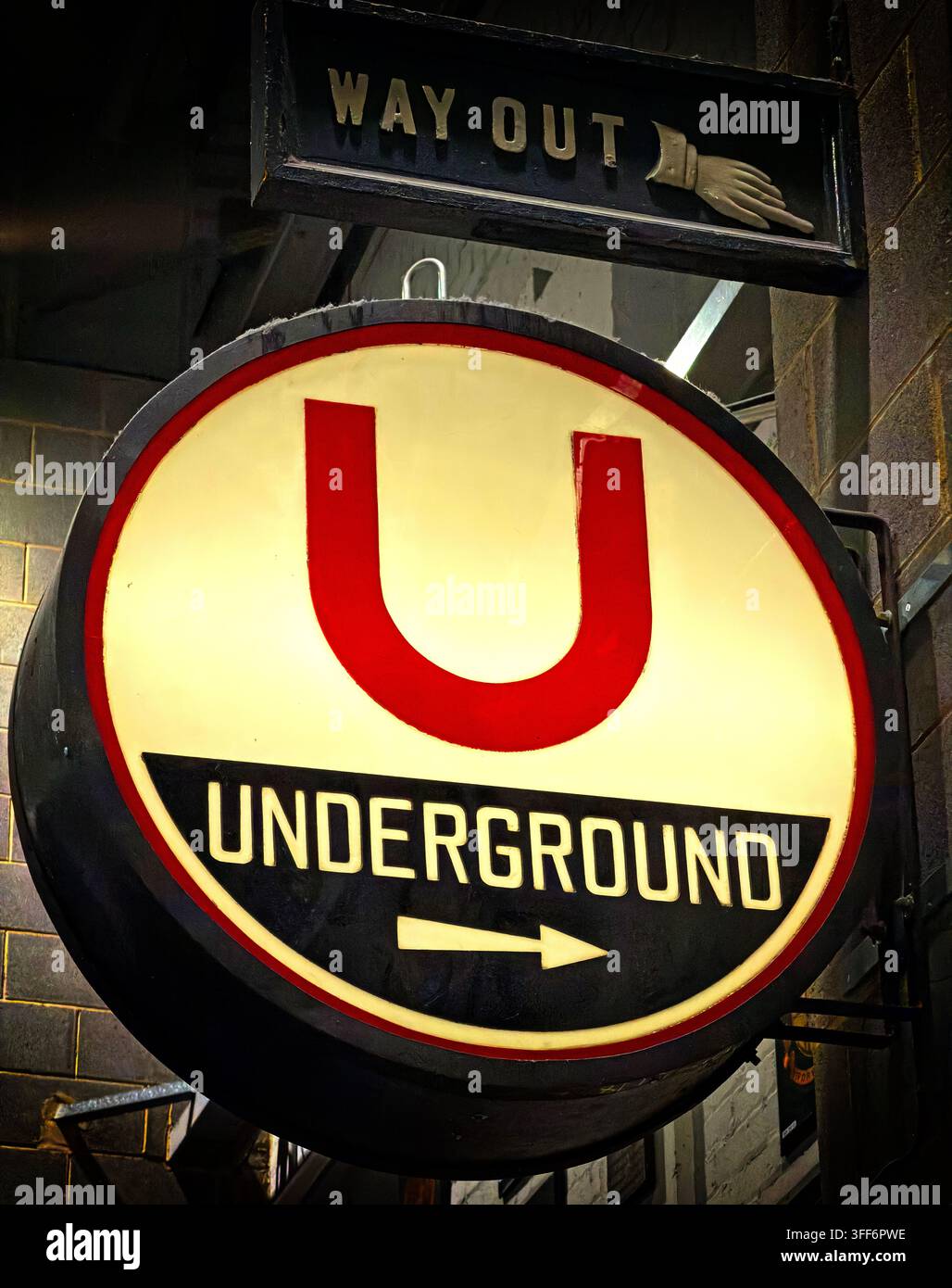
Image details
Contributor:
Tony SmithImage ID:
3FF6PWEFile size:
97 MB (4.7 MB Compressed download)Releases:
Model - no | Property - noDo I need a release?Dimensions:
5178 x 6548 px | 43.8 x 55.4 cm | 17.3 x 21.8 inches | 300dpiDate taken:
5 September 2026Location:
London, England, United KingdomMore information:
Historic London Underground signage showing a large red U above the word UNDERGROUND, with a traditional Way Out fingerboard and pointing hand mounted above. The design belongs to the long visual history of the Tube, whose famous roundel grew from efforts to make station names stand out clearly amid platform advertising. Transport for London dates the first Underground bar-and-circle device to 1908, when a red enamel disc and horizontal blue name bar were introduced at station platforms. During the early 1910s the Underground name was increasingly combined with the symbol as the network developed a stronger common identity. Publicity manager Frank Pick then commissioned calligrapher and typographer Edward Johnston to create a distinctive company typeface. Johnston’s lettering was incorporated into a revised symbol in 1916–17, helping establish one of the most recognisable transport identities in the world. The familiar red ring crossed by a blue bar developed from this work and became deeply associated with London itself, while later standardisation brought consistent signs, maps, posters and station architecture across the system. This photographed sign differs visibly from the modern standard roundel, using an emphatic red letter U and dark lower panel, making it useful as an example of historic or heritage-style Underground branding rather than contemporary TfL signage. The Way Out sign above adds another layer of period transport design, using a pointing hand to direct passengers before modern pictograms and standardised wayfinding became dominant. Such surviving or recreated signs evoke the development of corporate identity, typography and passenger information on the world’s oldest underground railway. For editorial use, the image connects London transport history, railway heritage, graphic design, branding, public signage and the enduring cultural status of the Tube as a symbol of the British capital.

