Creating images for book covers is an exciting and satisfying way to explore a new direction in photography and go on a creative journey – and as a stock photographer it is a great way to adopt the role of both artist and graphic designer. It’s an approach full of creative possibilities; seemingly minimalist but then complex, bright and colourful but also subdued and monochromatic.
Do your research
This is mentioned a lot. It is a good idea to absorb the ‘look’ of book covers and spend some time at a bookshop perusing covers illustrated or photographic, that are similar to your narrative style. Include books in your research from different genres – in particular the suspense and thrillers, fantasy and sci-fi, romance, historical and Young Adults (YA). You can also check out the following links for more inspiration and in-depth analysis of covers 50 amazing covers and for illustrator’s book cover illustration tips. To see the latest popular books broken down by subject you can visit the good reads website.
Think like a graphic designer
“When you’re shooting book covers, you’ve got to think more like a graphic designer than a photographer.” Says Rekha Garton, an experienced photographer of book covers who runs a workshop on this very subject, see more details on her website. Very often the image is simply a canvas that will be ‘dressed’ with eye catching typography and graphics – you don’t want to be creating a specific scene but elements that hint at the story and engender speculation. A designer at Penguin adds that it’s “best if the photograph has space to breathe. There should be room for type. The designer should be able to make a crop if necessary. So when photographing allow some space so the photograph can be used creatively on a book cover.”

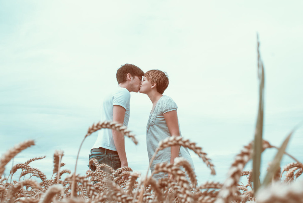
Create mood and mystery in your frame
Freelance researcher Zoe Norvell from Simon and Schuster highlights mood as the single most important thing. It’s not something easy to pinpoint but the “mood has to be just right”. “It’s times like these that I’m paying close attention to colour and lighting, which usually dictate mood. The final subject may be a lamp, a man, a house, or a shadow on the wall – but the main reason the image works is because the mood is right.”
Keeping it Real
Zoe adds that the “biggest let down when looking for photography for me is usually the model and styling. I’m drawn to models that look like real people, not models.” As the stories she is illustrating involve “everyday people, and everyday people are beautiful, so that’s who I want to feature on my cover”. Another researcher commented on the need for authenticity and finding images that are not clichéd or stereotypical. Something which I would say can be applied to lifestyle stock photography in general with authenticity being in demand with a whole range of image buyers.
Styling
This was considered a very important element of the whole process as an outdated choice of clothing can ruin the effect of an image which may have the perfect lighting and mood for a book cover. Zoe again; “Too often, I see shots in which clothing was clearly an afterthought and perhaps the photographer didn’t want the wardrobe to be too loud so they went with something simple which can end up looking outdated. I believe if styled correctly and realistically, the right clothing becomes quiet because it will look genuine. If it looks genuine, it doesn’t distract me from the image because the whole thing comes together succinctly.” Another researcher backed this up saying if you can, hire a stylist.
Cover all angles
A useful tip when planning your shoot is to cover different angles so the client has a choice of perspectives to pick from to work with their layout. Some shots should be with the face obscured so from behind, to the side etc. It can be shot shooting with part face showing or not at all or leave room for crop. Placing the full face is often not required as it allows the readers use their imaginations to create the characters. Some clients, when searching have been disappointed in the lack of nuance in moods and expressions. One client required a child alone and found the photographs fell into 2 camps – “either very happy or really miserable, and little middle ground, and surprisingly unimaginative”.

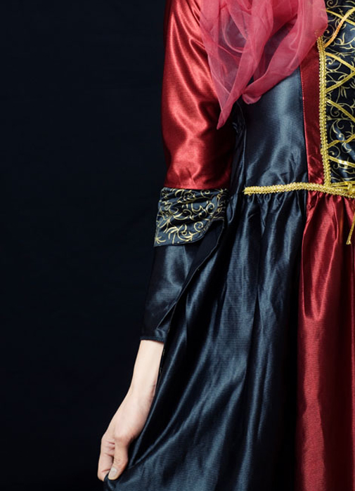
Recreate the past
Images reflecting different eras are hugely in demand for book covers, down to the popularity of historical novels and dramas set in different eras. I expect with the huge popularity of the recent tv drama ‘Deutschland 83’ that this decade could see a revival. Victorian and Medieval times are particularly popular as well as Gothic, Regency, Edwardian, retro and vintage inspired photography. When keywording your images always ensure you include the decade and era so clients can easily find the images. One researcher was searching for a 1940’s couple and found it difficult to find an image that had an “authentic old-weathered photo feeling” without running into a model release issue. They also mentioned the desire “to use images that look more like art photography” particularly as it’s so difficult to obtain rights for commercial use for images shot by famous art photographers like Irving Penn and Cartier-Bresson.
Any trends/advice?
We asked some art buyers specialising in book covers for their perspective and here is what they said:
- Don’t forget good black and white photography.
- In terms of new trends the small running figure may have had its day and we many now be looking more at a large close up figure with a scene within it.
- There is a trend towards more illustration, where the typography and the images are drawn or painted with a much more hand-crafted feeling.
One client was particularly drawn to modern still life. These are well lit shots of small, everyday objects; usually on their own, and featured on colorful, monotone backgrounds or paper. She’d seen this done beautifully with marbles, stamps, legos, keys, coins, flower petals, origami, animal figurines and small toys, and when done right found the effect very captivating! These types of shots work well for today’s memoirs and non-fiction pieces.
While researching this I came across this quote from a senior director at Little Brown Books. “If your work doesn’t look like any cover you’ve seen, then don’t send it to the publishers.” book cover source.
Another client highlighted the use of composites and in her case it was pretty rare to use a photograph straight these days – a lot of their covers are made up of many images. The majority of their covers are composites of one kind or another, some with all found imagery and some with a mix of found images which are then combined with shoots they do themselves.
My trend would be to consider playing with double exposure photography – this is also a current trend in general stock photography. The layering and ambiguous nature of the process lends an air of mystery and enigma as well as subtly suggestive the narrative – perfect for book covers!
To end, I think the following observation from Zoe Norvell from Simon & Schuster reflects the essence of a good cover photo and why:
“…When I’m finding the right photo, everything needs to come together: the model, their expression, their wardrobe, their hair, the setting, what’s in the background, the lighting….”
From a theoretical point of view the visual needs to do a number of things. Distil the essence of the book without giving too much information away but at the same time be truthful to the narrative.
Easy? Don’t think so but imagine the joy and kudos of seeing your book cover on display!
For more book cover visuals check out this book cover lightbox.