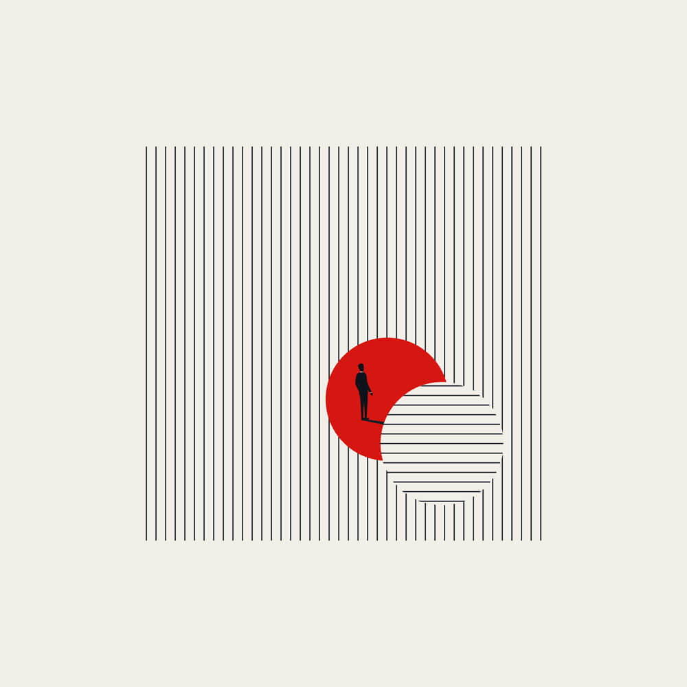
Think you know concept vectors? Think again. We were really impressed when we discovered Jozef Micic’s stylish modern graphics. By playing with scale and perspective, resolutely sticking to a limited colour pallet and using bold repeated shapes, he has managed to reinvent the humble business concept illustration into something much more appealing. Impressive given how saturated this corner of stock content can be!
Based in Slovakia, Jozef’s work has been shaped by numerous influences, from monumental landscapes to (perhaps more surprisingly) the work of nineteenth century painter J.M.W. Turner.
Read on to find out more about Jozef’s career in illustration and design.
LG: How long have you been an illustrator/graphic designer and what made you want to get into illustration/graphic design?
JM: I’ve been doing illustration and graphic design full-time for 13 years now, but I never really considered it as a career at first. It just came about naturally when selling stock illustrations became my main source of income, and from there, it naturally expanded into graphic design. I have done smaller occasional projects since I was a teenager, though.
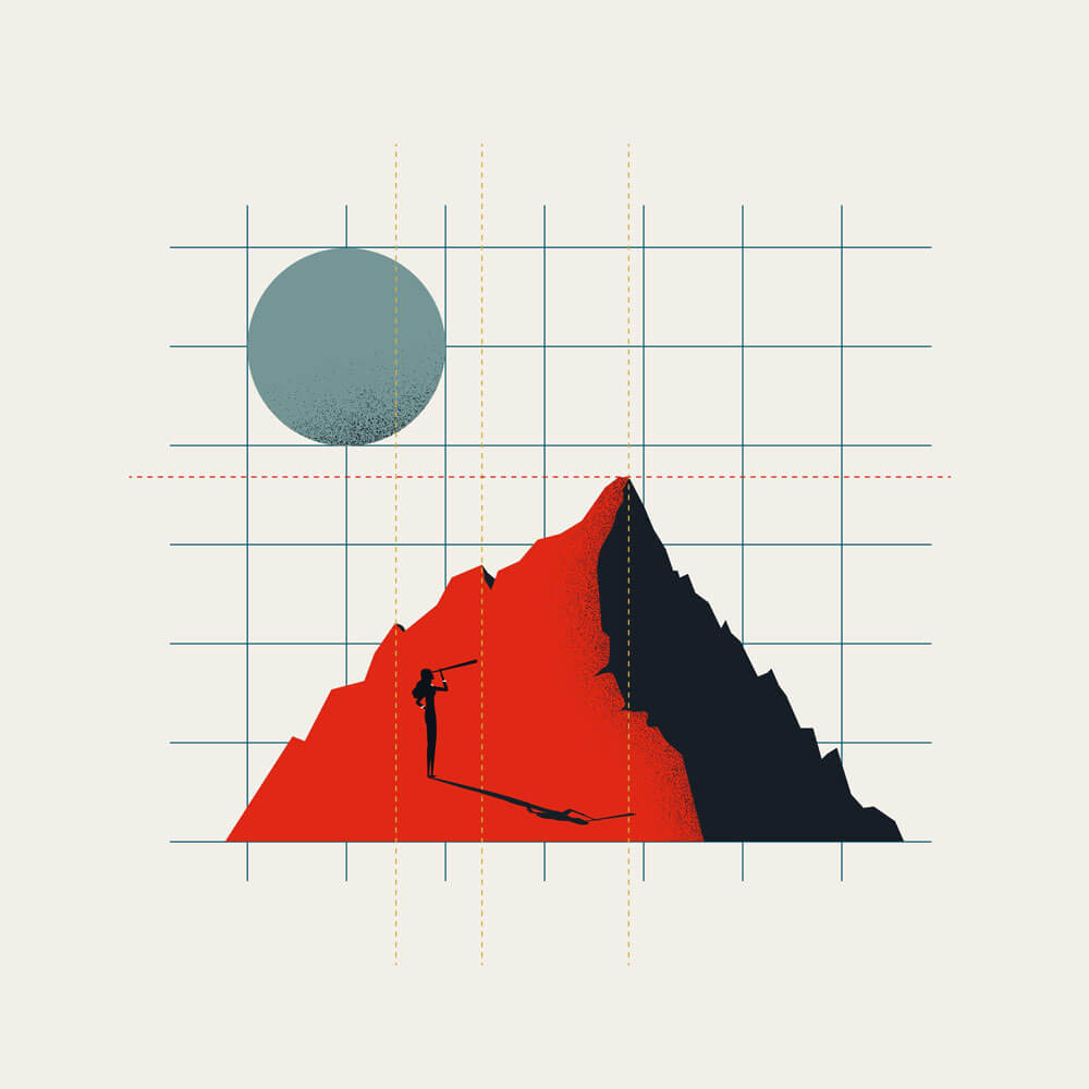
Even as a kid, I always enjoyed drawing monumental things—vast mountain landscapes or massive, detailed castles with tiny figures on them. I always liked playing with that huge contrast in scale between giant environments and small human elements. I guess that’s where the origins of my current minimalist illustrations come from.



LG: Looking through your collection it seems like your work is influenced by the Bauhaus movement. Is this observation accurate and if so, what led you to become influenced by this design style? If not, are there other styles or movements that have influenced you?
JM: I do really like the Bauhaus movement because of its simplicity, strong shapes, and clarity, but it’s not exactly my main source of inspiration. I have many influences and it’s hard to define just one – I also get a lot of ideas from modern architecture, collages, etc. But actually, my favourite painter is J.M.W. Turner, precisely because of his monumental paintings with tiny subjects in contrast with a giant environment. It really connects to what I have loved drawing since I was young.
LG: Which is your favourite illustration from your collection on Alamy and why?
JM: I guess it would be this one. It shows a massive red tower made of cubes. I like it because it brings together a lot of the things I mentioned before – the architectural influence, strong simple shapes, and that monumental scale. It was designed to represent a business concept of growth, but visually, it just has that huge contrast that I enjoy creating in my minimal style.

LG: Your style and colour palette remain very consistent throughout your collection; does this help when working with clients (as they know exactly what they’ll be getting) or does this sometimes limit the work you could be commissioned for? Are there pros and cons to this way of working and if so can you talk a bit about them?
JM: It definitely helps with the “brand” image, so my work gets easily recognized. I came up with my style and colour palette specifically for the stock market, to have a distinct look and be recognized by buyers. I don’t feel it limits me too much. Actually, people who buy my stock illustrations often reach out and ask me to design other things for them, like logos, posters, or brand identities.
LG: Can you talk us through your work process? How do you come up with a concept? Is it all digitally produced or is there a hand-drawn element to it? What software do you use?
JM: I have various methods. I have lots of small notebooks lying around, filled with either handwritten text descriptions or hand-drawn sketches of future illustrations. I also often use Pinterest, Behance, Dribbble, and other typical websites for inspiration.
A lot of inspiration comes from architecture, so a walk through the town where I live or looking at a modern architecture photo gallery provides a lot of ideas too.
I use Adobe Illustrator for all the illustrations in my stock portfolio, mainly because they are vectors, so they can be easily edited by the buyers.


LG: Here at Alamy we have a no-AI policy when it comes to imagery. Do you have any thoughts on the rise of AI to produce ‘artwork’?
JM: I have mixed feelings about AI. Obviously, as a creator, I feel the impact of AI, especially when it is used to create copies of an artist’s artwork rather than creating a unique style (if it’s even capable of doing that). On the other hand, when I do client work such as logos or web design, it’s a great tool for rapid iteration in the ideation phase and for mockups when the design is finished.
LG: Do you have any advice you’d give to illustrators who might be just starting out?
JM: Don’t worry too much about finding your perfect “style” on day one; that will develop naturally over time. Free your mind and just create. Do your research, explore each idea to some extent, and learn to find what works in real world and what doesn’t. Judging your own artwork can always wait.
We hope you enjoyed this introduction to Jozef’s work. Hopefully it has shone a light on how eye-catching concept vectors can be. You can view Jozef’s full collection on Alamy here, and visit his website here.
If you’d like to find out a bit more about how vectors can be used in your projects, check out our ‘How to utilise vector graphics‘ blog.